FastChow.
A rebuild of the Chowdeck mobile app.
A personal project, built by me on my own. It is not affiliated with or endorsed by Chowdeck, and the name and brand belong to them.
I rebuilt the Chowdeck mobile experience from the ground up, with a focus on performance, responsiveness, and removing friction from the flows people use every day.
This was not a visual recreation. I looked at the parts of the existing experience that felt slow, repetitive, or harder to use than they needed to be, then redesigned and reimplemented those interactions on a more responsive architecture.
There is no public Chowdeck API, so I had to work it out myself. Mapping it is normally where most of the time on a project like this goes, so I did it with Claude Code: I gave it access to my own Chowdeck account and let it work through the request logs the app produces, endpoint by endpoint, until the whole thing was written down. That freed up the time to spend on the app itself.
What came out of it is 28 screens over 38 endpoints, one codebase for both platforms, running against the live API with vendors and prices. I called it FastChow.
The goal
The goal was simple.
What would the Chowdeck app feel like if every interaction was fast and immediate?
I focused on the parts of the app people use most often:
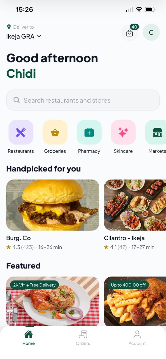
- Browsing restaurants and meals
- Searching for food
- Managing favourites
- Tracking active orders
- Funding a wallet during checkout
- Viewing transaction history
- Interacting with maps
- Receiving app updates
Performance first
The biggest focus of the rebuild was performance, and most of it came down to render work rather than network speed.
The home feed was janky at first. The images was a bit part of the cause and the app was repeating work it did not need to. Every card on screen was being rebuilt while you scrolled, because of how the list was wired together. Once each card only redrew when its own content changed, the scrolling smoothed out. That was most of the fix, before any library got swapped.
The rest is the same idea in different places. Screens show what they already have and refresh underneath, so going back somewhere is instant instead of a spinner. Cards reuse the same views as you scroll instead of building new ones. Tabs load when you first swipe to them and stay loaded, with the next one warmed up in the background, so swiping between search tabs does not stall.
The bag works this way too. It lives on your phone first. Tapping plus updates the screen straight away and the server catches up a moment later, in one batch, instead of a request per tap. You are never waiting on the network to find out whether your own tap counted, and rapid taps cannot fight with a stale reply.
The difference is most noticeable on lower-end Android devices, where a poorly optimised interface turns sluggish quickly. The objective was not to make the app technically faster. It was to make it feel faster.
Images that were bigger than they looked
One thing was not render work. My order history runs to 928 orders, and scrolling it stuttered. I went through the usual suspects first and got nowhere, so I took the vendor logos out of the row and scrolled the whole thing again. Nine hundred rows, completely smooth. It was the images.
So I measured what each row was actually downloading. Every logo is served straight from files.chowdeck.com, at whatever size it was uploaded at, and some of them are enormous. These are the nine on the first page of my history, all of them drawn into a 44pt tile:
xwRxdPYhS5NBiy9ASr37m.jpg6000×4000 · 11.3 MB → 5 KB7PcCitFSzussnlcquKroQ.png1132×1666 · 2.5 MB → 6 KB0aIZqvwy2zzQACTCGRyvz.png342×333 · 216 KB → 8 KBQR588tmPzxprQjpjMpZox.png389×300 · 185 KB → 3 KBq1zTFpKyVSwGuUwG9gXiM.PNG200×300 · 129 KB → 17 KBwmJal3MNKhAR0TZddwg0H.png300×300 · 131 KB → 11 KBzBS5ri2paEw77kcxKZqeE.png300×300 · 32 KB → 2 KB1691005343.png298×300 · 20 KB → 1 KB26ZdGoZo84ZsssickSO7k.png300×300 · 11 KB → 1 KB
The biggest issue was the restaurant logos. Some were 24-megapixel photos being shown in a tiny 44pt image. A 3× screen only needs about 17,000 pixels for that, but these images had around 24 million. Every row was downloading about 169× more image than it needed. At 60fps, the app has just 16ms to render each frame, and decoding an image that large can use up most of that time on its own.
The original Chowdeck app never trips over this, because you scroll past ten orders and stop. Mine scrolls hundreds of them, so it hits every vendor in the space of a few seconds.
There is no resizing on the API side. The files sit on plain storage, and every resizing parameter I tried came back byte-identical to the original. So I put a small Cloudflare Worker on my own domain. It takes an image URL and the size the app is about to draw it at, fetches the original once at the edge, and returns it resized and re-encoded as AVIF or WebP depending on what the device accepts. Cloudflare caches the result, so each image is only ever processed once.
The same page of rows went from 14.1 MB of images to 48 KB. The 11.3 MB logo comes back as a 5 KB AVIF. Requests are checked against a list of known image hosts before anything is fetched, and if the Worker cannot be reached the app loads the original image instead, so a proxy that goes down costs speed rather than a broken screen.
Two smaller things came out of the same work. Images now ask for the size they are actually rendered at rather than whatever the file happens to be, and sizes are rounded into buckets so a 131pt and a 133pt layout do not generate two near-identical images. And the app reuses a decoded image by its URL rather than by the row it appeared in, so the six orders you placed at the same restaurant share one decode instead of doing six.
Switching tabs
The tab bar is the most-tapped thing in the app, so it should never be somewhere you wait. Home, Orders and Account switch the instant you press them, and they hold the place: what you had loaded and where you had scrolled to is still there when you come back.
You can hammer between all three and it keeps up. No flash of empty screen, no reloading something you were already looking at a second ago.
A more fluid update experience
App updates are usually disruptive. You get a modal you cannot dismiss, or a trip to the store, and it lands in the middle of whatever you were doing.
Here, an update shows up as a banner above the feed. You can ignore it and keep going. If you take it, the new build downloads in the background while you carry on using the app, and the banner turns into a restart when it is ready. The update stays clear and easy to finish without taking the app away from you first.
It ships over the air, so a fix can reach people the same day instead of waiting behind a store review.
Search that gets out of the way
Search is one of the most important features in a food delivery app, and one of the trickiest to get wrong. It is also the part of the current app people complain about most.
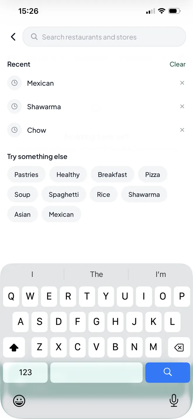
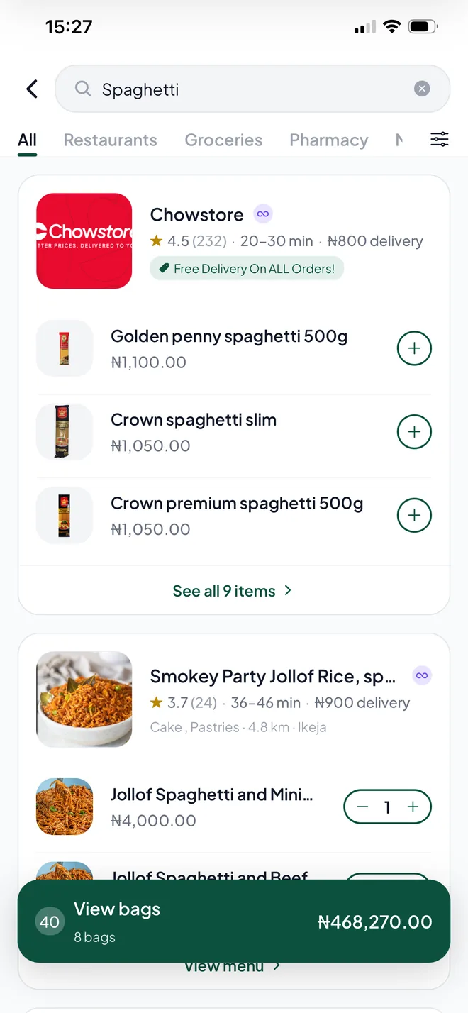
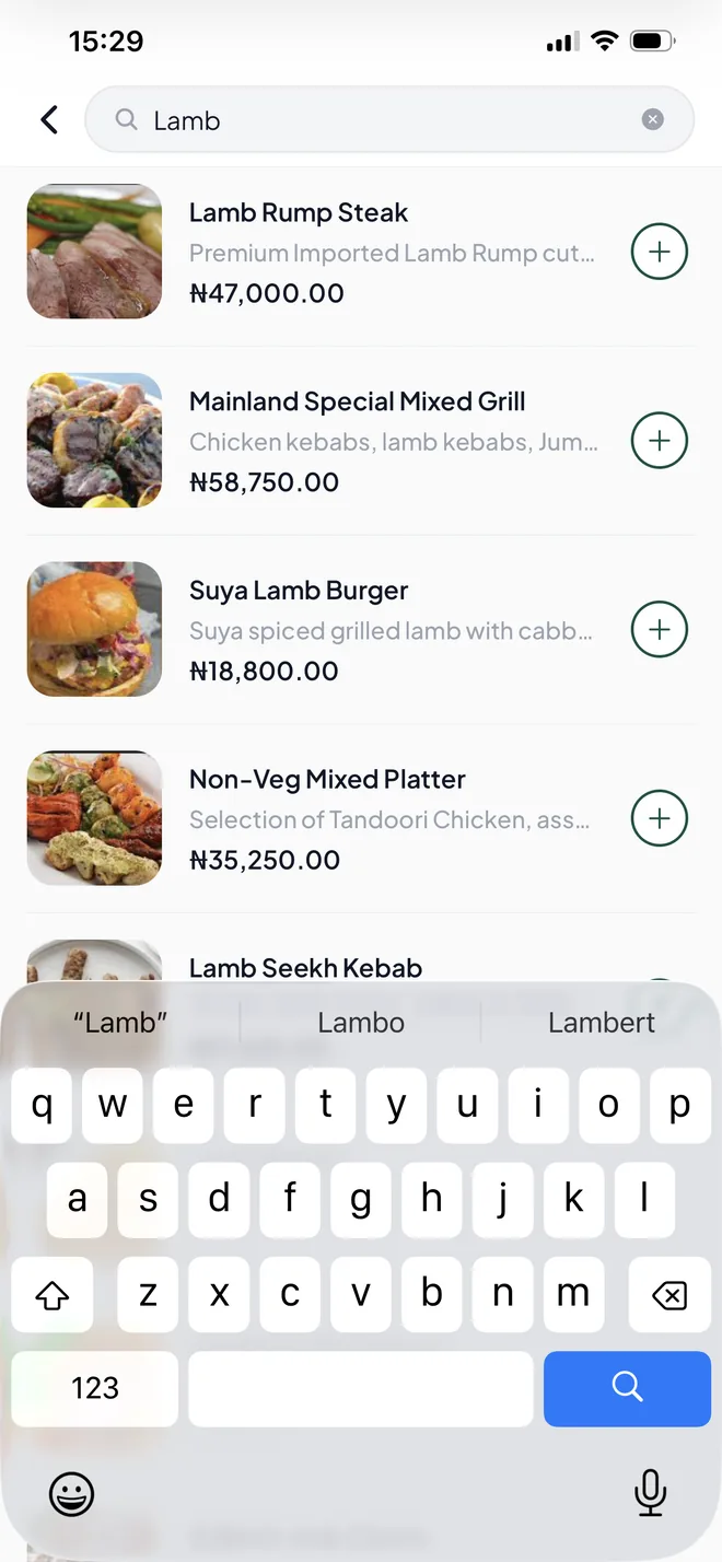
The empty state carries recent searches and a set of categories, so the common case is a tap instead of typing. Queries are debounced and cancelled as you type, so fast typing does not queue up stale requests. Results stay on screen while the next set loads instead of blanking out. Results come back grouped by store, and items can be added straight from the list.
The result is search that works the way it should on mobile: type, find, move on.
Favourites that actually work
Favouriting is a simple interaction, but it has to feel reliable. In the current app it can be inconsistent, and you are left unsure whether the tap did anything.
Here the heart fills the moment you press it, and the request goes out behind that. If it fails, the heart goes back. Your favourites row on the home screen updates at the same time, so you can see the place you just saved without going looking for it. It's a small interaction, but can make a big difference in how the app feels.
Order updates without constantly going back
Keeping up with an order is one of the biggest sources of friction in the whole product. Normally you end up navigating back and forth between screens to find out whether anything has changed.
The rebuilt order screen keeps itself current. Status, the rider on a map, and the full history of everything the order has been through, all in one place. When I am looking at my order, I should be able to trust that I am seeing the current state.
Wallet balance updates during checkout
Funding a wallet at checkout has the same problem as the order screen. You add money, and then you are moving between screens, or closing and reopening the app, just to get the balance to catch up.
I redesigned it so the balance updates in the flow you are already in. You top up, you see it land on the checkout screen, you place the order.
Transaction history
Chowdeck has this already. I built my own version because the wallet felt incomplete without it, and because it is the thing that makes a balance make sense: top-ups, order charges, refunds, partial payments and gift card redemptions, grouped by month and filterable by balance type.
Addresses
Choosing where your food goes is a small screen that gets used constantly, so it should be quick and quiet. Saved addresses are right there, adding a new one is a search field and a couple of taps, and switching between them does not reload the world around it.
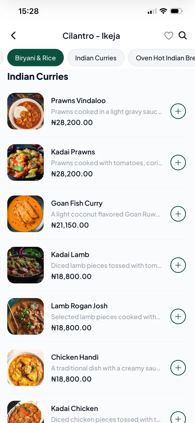
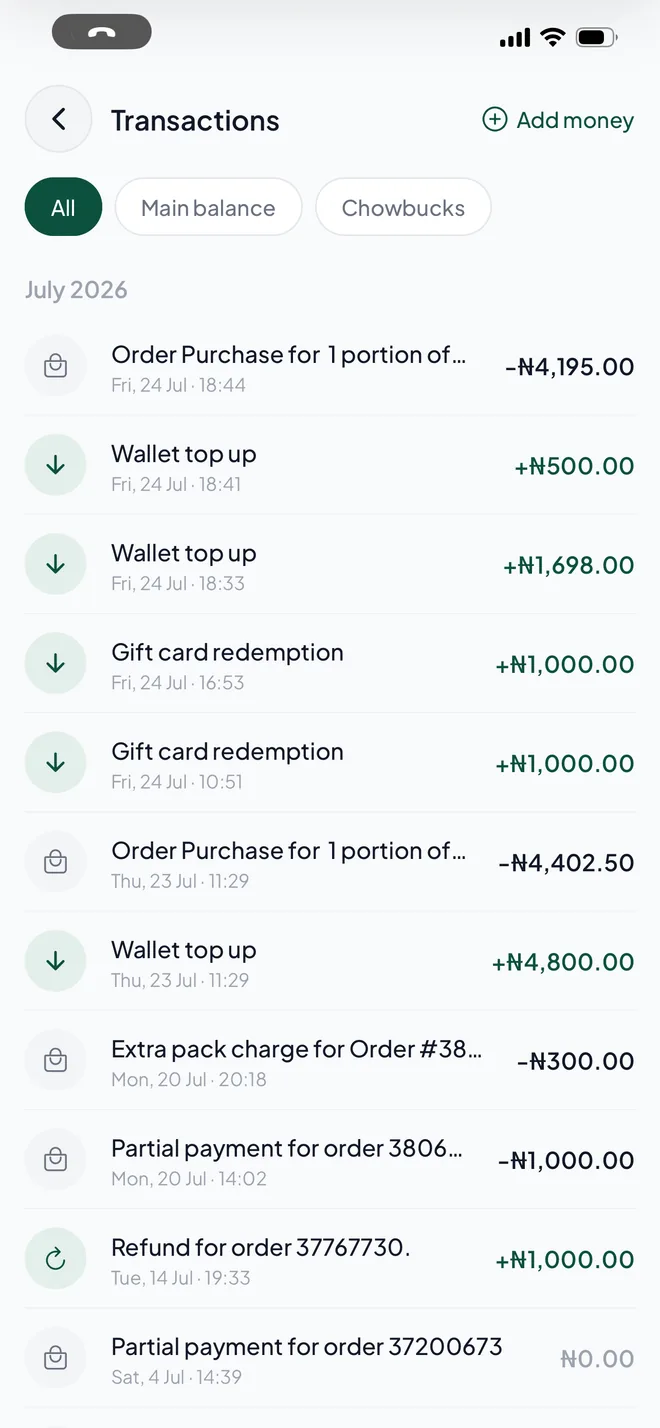
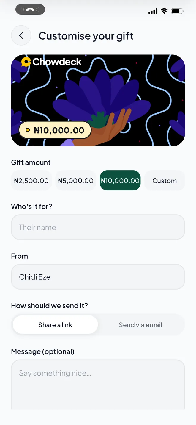
Every screen
I stayed as close to Chowdeck's look as I could without treating it as a spec: the greens, the accent colours from the category tiles, the chunky corner radii, and Plus Jakarta Sans throughout. Some of it is yours, some of it is my read on it. This page is set in the same colours and type.
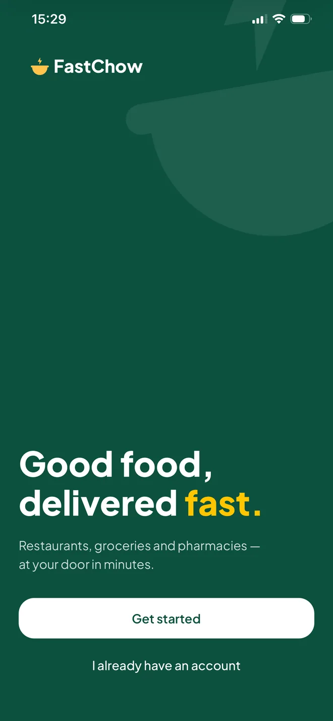
Onboarding
Home
Search
Results
Store menu
Menu search
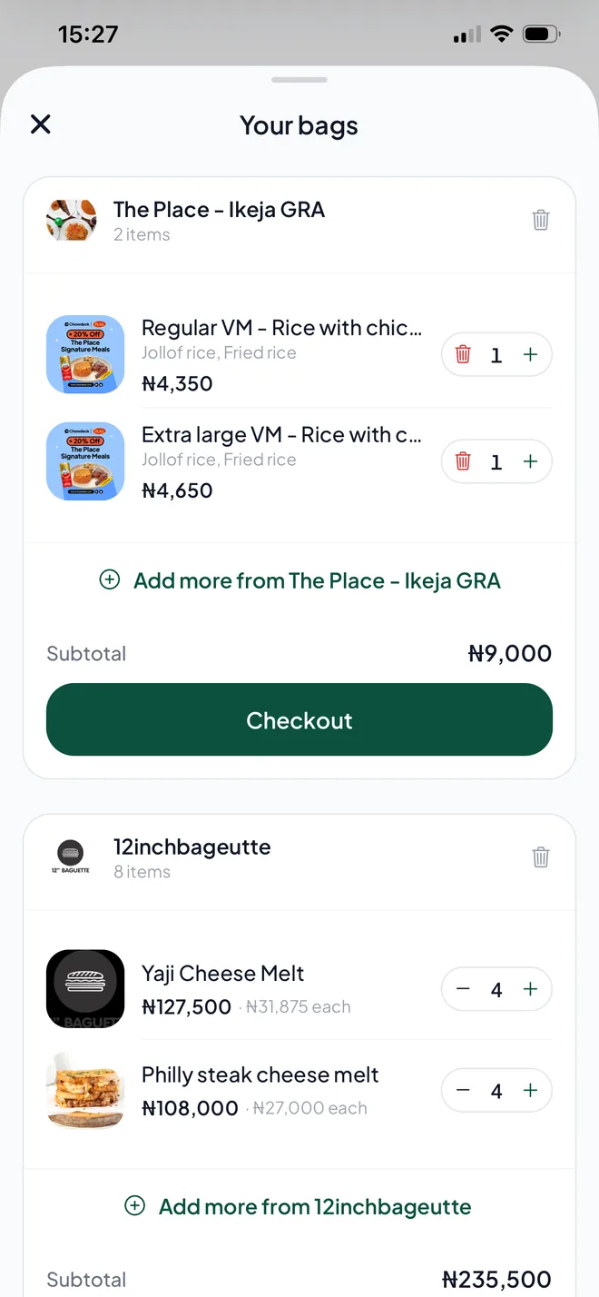
Bags
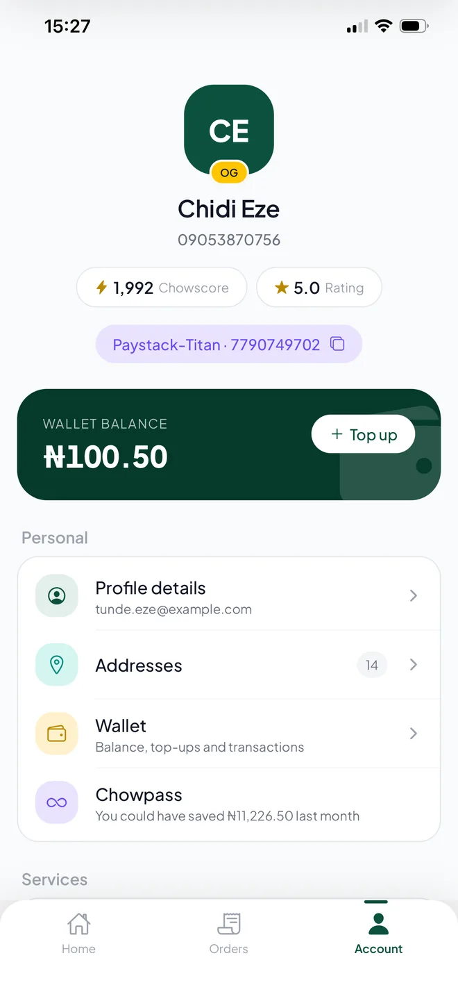
Account
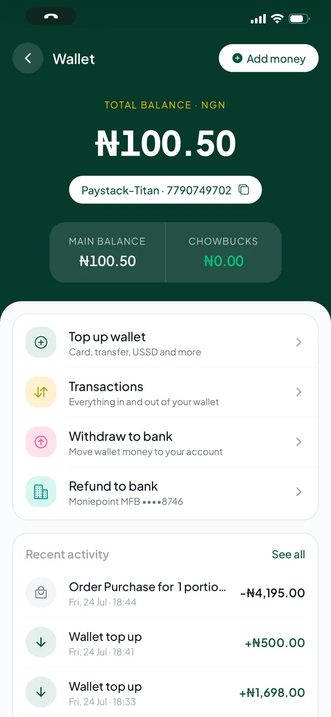
Wallet
Transactions
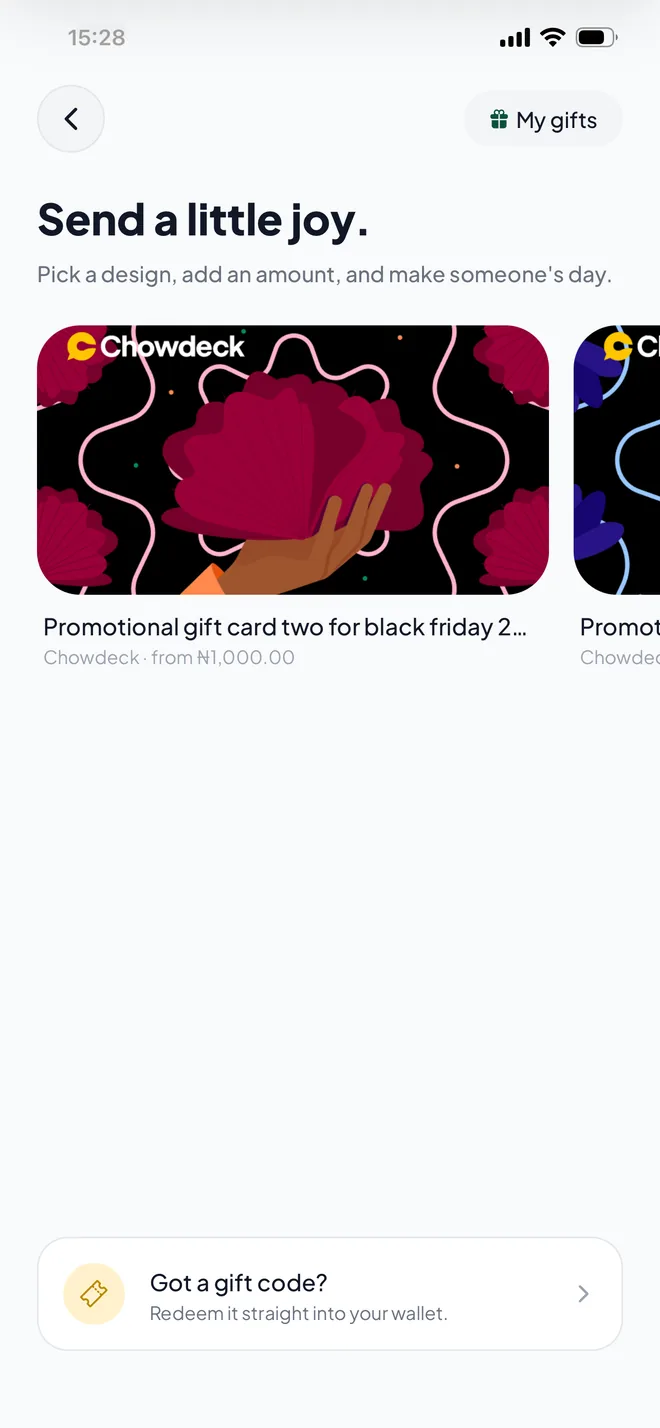
Gift cards
Gift setup
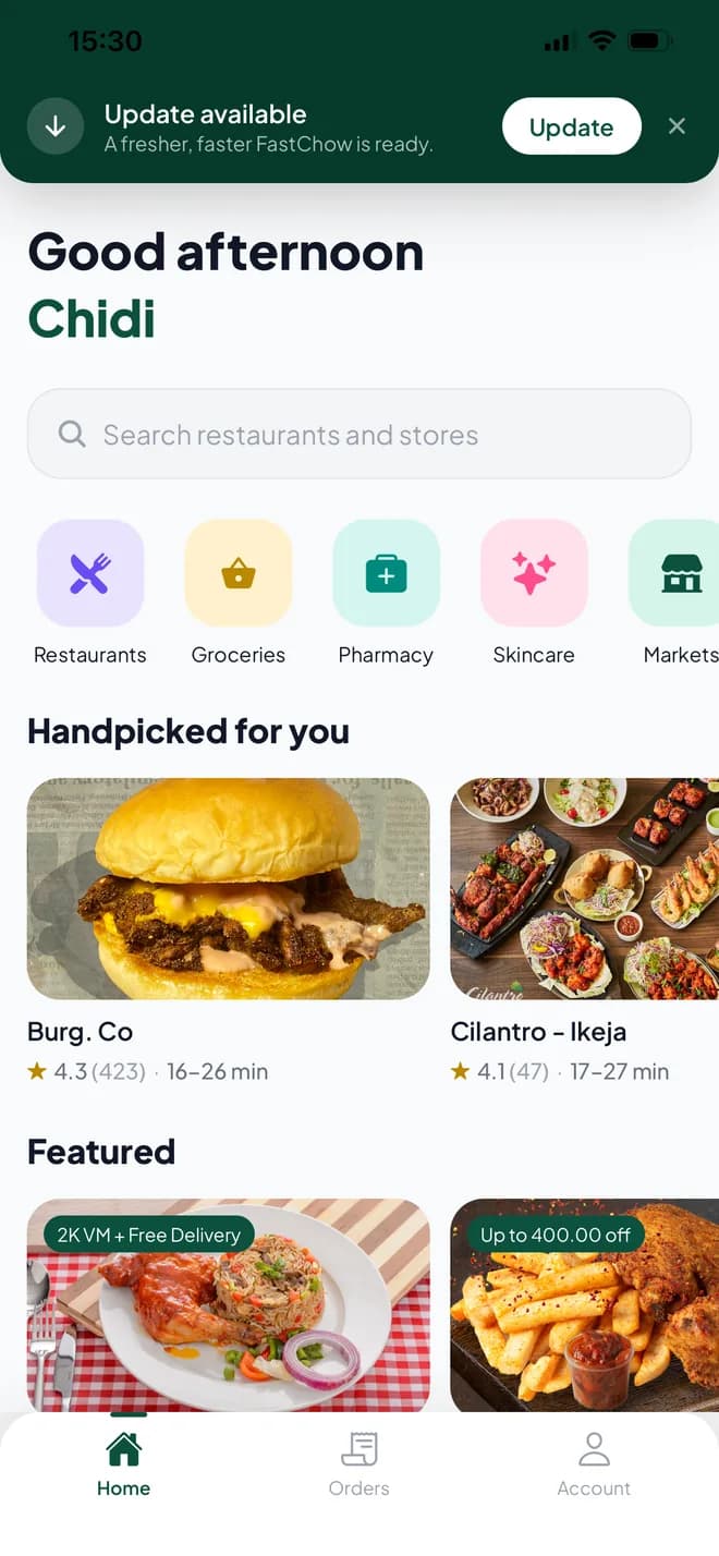
Update banner
The whole app, in one take
Two and a half minutes of the app, unedited, running against the live API.
One take, start to finish: cold start, browsing, a bag built across several stores, checkout, tracking, wallet, gift cards, search. Running against the live API.
Jump to
How it is built
Everything the app knows how to ask for lives in one place: a separate package of 16 modules, one per area of the product, with every response checked as it arrives. If Chowdeck changes something on the side, it fails loudly in one spot instead of quietly breaking a screen.
The app on top of it is Expo and React Native, so iOS and Android come from the same codebase, and updates can go out over the air.
- Expo SDK 57
- router, dev client, over-the-air updates
- React Native 0.86
- new architecture
- TypeScript
- end to end, including the API package
- TanStack Query
- caching, revalidation, optimistic writes
- Zustand
- local-first bag state
- Reanimated 4
- gestures and transitions
- FlashList v2
- recycled list rendering
- Shopify Restyle
- design tokens
- Zod
- runtime contracts on every response
- React Native Maps
- tracking and address picking
The result
The biggest improvements here are not new features. They are the moments people repeat constantly: searching, scrolling, switching screens, favouriting, checking an order, funding a wallet, waiting for an update.
The idea was simple. Remove the waiting, remove the unnecessary navigation, and make every interaction feel immediate.
Install it directly. You may need to allow installs from your browser.
If the invite is full or the link gives you trouble, leave your email and I'll add you by hand.
FastChow is an independent rebuild, built as a portfolio piece. It is not affiliated with, endorsed by, or distributed by Chowdeck.
Other apps I've built
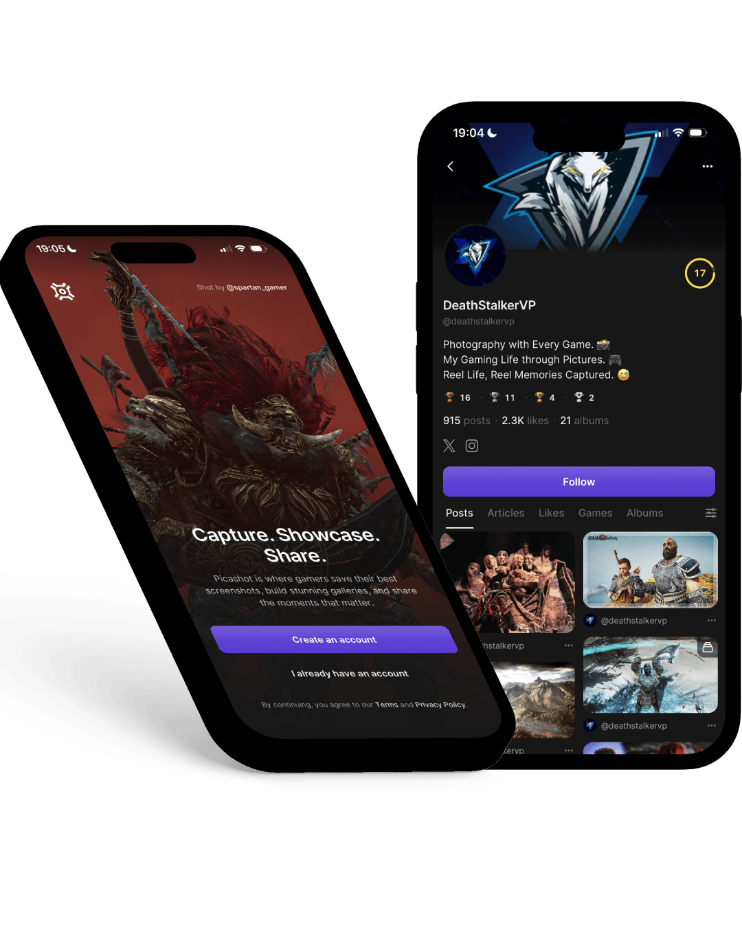
Picashot
A home for in-game photography. Over 200,000 photos so far, and a couple of thousand more every month.
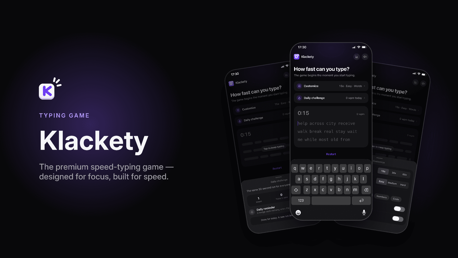
Klackety
A typing game that sounds and feels like a mechanical keyboard, down to the haptics on every key.
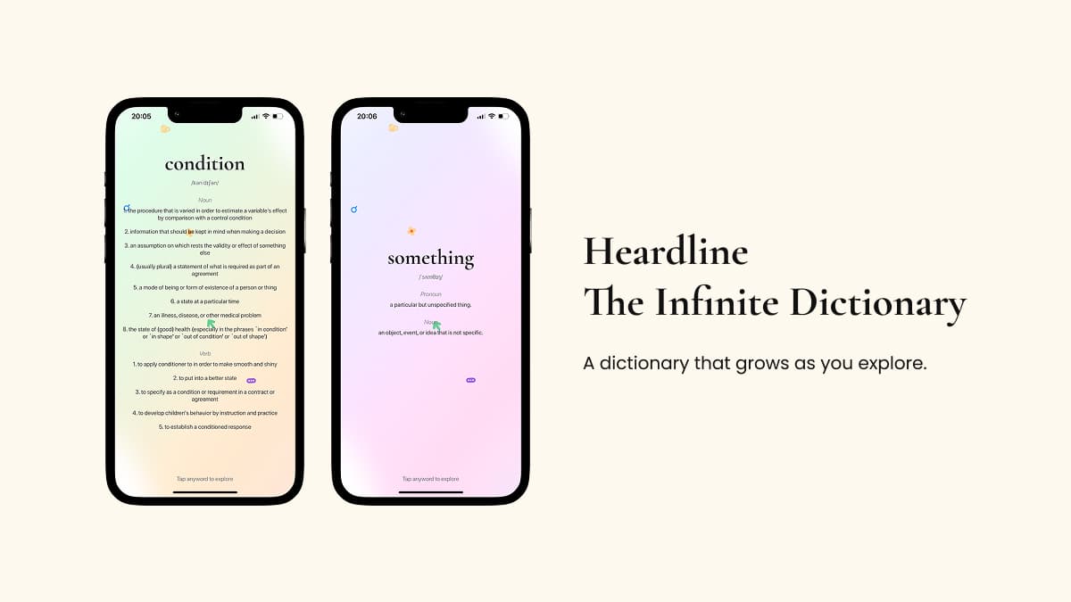
Heardline
An endless dictionary. Tap any word on screen for its meaning, then tap any word inside that meaning, and keep going as far as you want.
Two Steps
A walking app that plans a loop from your door, and keeps it off the streets you have already covered.